
Art: The Salt Girl and Cult of the Kiln
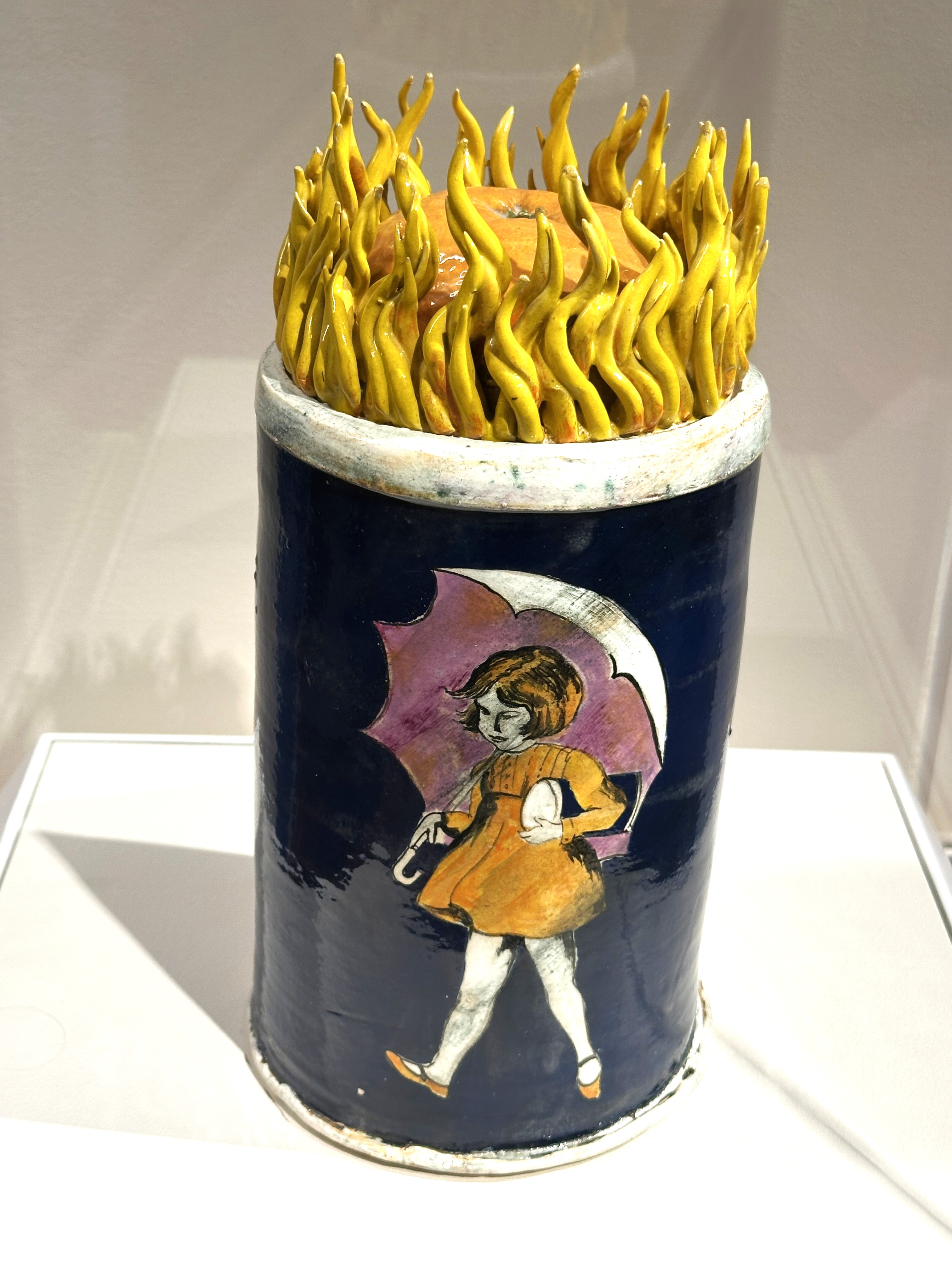
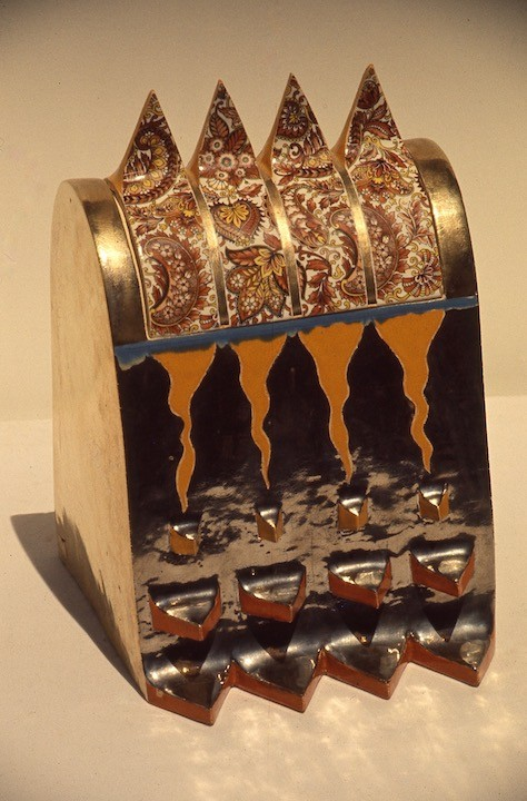
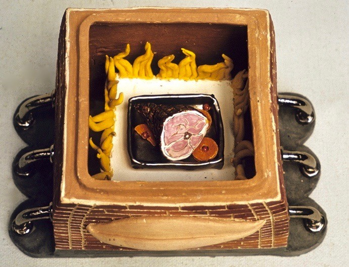
Seattle-based Patti Warashina made a series of art pieces that humorously spoke to the Cult of the Kiln and its association with male masculinity. With a silent nod to Funk Art, Warashina miniturizes kilns, while mentioning technical aspects of clay firing. The orange on the top of the “Morton Salt Kiln” represents the salt glazing, which produced as “orange peel” texture on the fired ware.
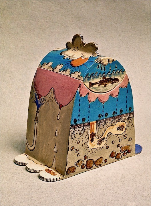
Patti Warashina was born in 1940 and has an impressive CV of works in art museums all over the world. She earned a BFA and an MFA from the University of Washington and over the years has produced a remarkable array of art. Some of the pieces she has from her Kiln Series (1968 – 1972) and shown below. And others are from her website.[1]
Many of her recent pieces decry the injustice endured by Japanese residents in the Pacific Northwest, who were inturned at the Tule Lakes Retreat during World War II. In total the US incarcerated over 120,000 citizens, forcably removing them from their homes. For many Japanese, their homes, businesses and lands were destroyed and never returned to them.




Back to the Morton Salt Kiln and the Morton story for a moment or two:
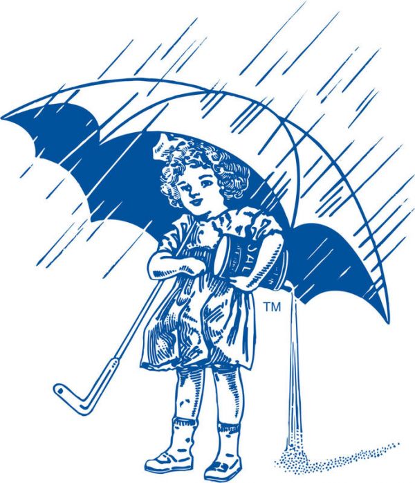
The motto that the Chicago based Morton Salt always had was “When it rains, it pours,” which highlights the quality of the commodity produced by Morton. This salt purveyor was competing against other companies whose salt became large, clumpy salt crystals when the humindity rose high enough, and the product would not pour from a salt shaker. The “secret sauce” that Morton added was an anti-caking ingredient, which allowed the salt to continue to flow.
The iconic corporate mascot (an unnamed young girl with an umbrella, was introduced in 1914. There have been six updates to the image over the years (according to Morton in 1921, 1933, 1941, 1956, 1968, and 2014).[2]
Not being sure if people are more interested in the Morton Salt Girl, who is celebrating her 112th birthday, rather than the Warashina art, here is a list of the changes to the look, the costume and the hair over the decades:
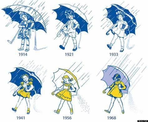
1914: The Original Debut
- The Look: She originally appeared in black-and-white print.
- The Costume: Her clothing resembled a classic “Sunday best” style common for children in the early 1900s.
- Hair: She was depicted with short, blonde, curly hair under a large, dark umbrella.
1921: The Roaring Twenties Update
- The Look: Her hairstyle received a complete overhaul.
- Hair & Costume: Reflecting the popular bob cuts of the 1920s, her blonde curls were changed to straight, short, dark hair with a large hair bow.
1933: The Shirley Temple Era
- The Look: Hollywood child stars heavily influenced her look.
- Hair: Her straight hair was reverted back to voluminous blonde curls at the height of Shirley Temple’s cinematic fame.
1941: The Iconic Yellow Dress
- The Look: This design marked the introduction of her most famous trademark features.
- The Costume: For the first time, she donned her signature bright yellow dress, which featured puffy short sleeves and playful polka dots.
- Hair: Her loose curls were gathered into bouncy blonde pigtails.
1956: Brightening Up the Umbrella
- The Look: The character illustration was brightened and given a mid-century pop-art feel.
- The Costume: Her dress collar was modified to be more prominent with spots that mirrored the styling on her skirt.
- Accessories: To match her dress, the umbrella canopy and its curved handle were changed to yellow.
1968: The Modern Silhouette
- The Look: This became the most widely recognized corporate version used for decades.
- The Costume: Her outfit was streamlined into a simple, long-sleeved, solid-yellow dress with a shorter, more modern hemline. Her socks were removed from the illustration entirely.
- Hair & Umbrella: Her hair was cut into a sleek, modern bob, and her umbrella canopy was returned to solid white.
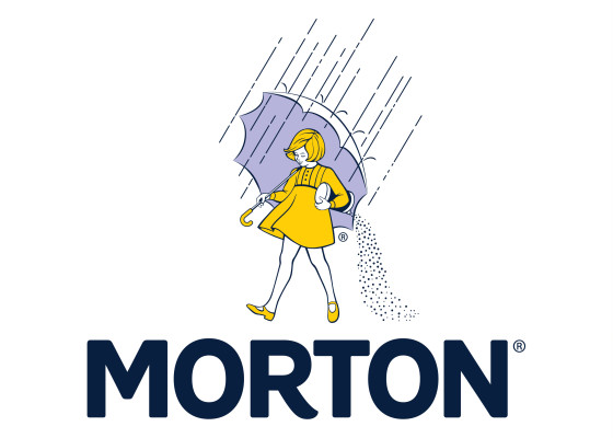
2014: The Centenary Refresh
- The Look: Cleaned up to match modern digital branding requirements for her 100th anniversary.
- The Costume: The overall 1968 silhouette was retained, but the artwork was modified with simplified, cleaner line work and minimal shading so it translates better onto mobile screens and modern packaging
============================================================
[1] https://pattiwarashina.com/section/445735.html. Patti has a massive collection of fine art, some outdoor and some indoors (like the miniature kiln series) are on display at galleries around the world. Her message continues to resonate and her works have earned the homage they have garnered for her and her creative expression.
[2] The Morton Salt images are mostly from the website: https://www.mortonsalt.com/about-us/

